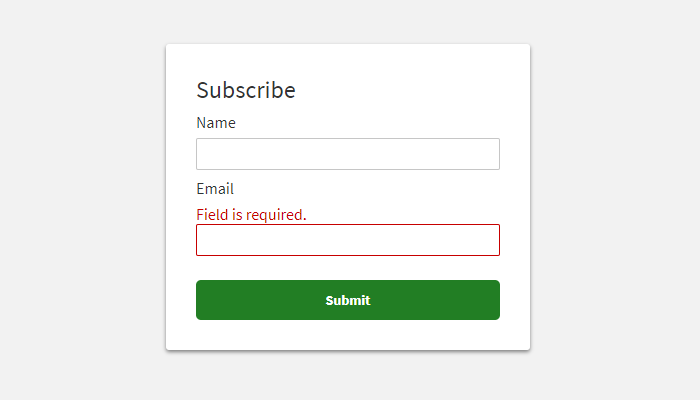
Say we have a text input that can be either in the valid or invalid state. If validation fails, we would like to add a red border indicating that something is wrong with the value that the user has provided. We do this by adding --error suffix to the class name.
<!-- correct value --><input class="my-input" type="text" />
<!-- validation error (red border) --><input class="my-input--error" type="text" />Using @extend directive
The @extend directive allows us to include all styles from another class and broaden them with new properties. It slightly bears a resemblance to inheritance in other languages.
.my-input { font-size: 14px; padding: 2px 4px;
&--error { @extend .my-input; border-color: red; }}It will be transpiled into:
.my-input,.my-input--error { font-size: 14px; padding: 2px 4px;}
.my-input--error { border-color: red;}Don't use parent selector in @extend
Note that Sass won't be able to transpile your code if you try to use parent selector & in the @extend directive. The extended class name has to be provided explicitly.
&--error { @extend &; border-color: red;}Sass compiler will throw an error like this:
Error: Parent selectors aren't allowed here. ╷7 │ @extend &; │ ^ ╵ index.scss 7:17 root stylesheetAlternative approach 1: Using placeholders
You can achieve the same with placeholders. Look at the code below. We assume that all properties that the .my-input class uses are defined in the %my-input placeholder.
%my-input { font-size: 14px; padding: 2px 4px;}
.my-input { @extend %my-input;
&--error { @extend %my-input; border-color: red; }}The transpilation result is almost the same as with the previous solution. The order of class names in the comma-separated selector differs, but it doesn't matter from the technical point of view.
.my-input--error,.my-input { font-size: 14px; padding: 2px 4px;}
.my-input--error { border-color: red;}Additional parent properties with placeholders
Interestingly with the "placeholders" approach, you can add additional properties to the parent that won't be part of the child. Let's add a green border if the input is valid.
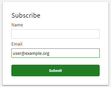
Consider this example:
%my-input { font-size: 14px; padding: 2px 4px;}
.my-input { @include %my-input; border-color: green;
&--error { @include %my-input; border-color: red; }}It results in the CSS like below. The child does not have green border property.
.my-input--error,.my-input { font-size: 14px; padding: 2px 4px;}
.my-input { border-color: green;}
.my-input--error { border-color: red;}Alternative approach 2: Using @include (mixins)
Yet another way is mixins, more specifically the @include directive. Look at the code below.
@mixin my-input { font-size: 14px; padding: 2px 4px;}
.my-input { @include my-input;
&--error { @include my-input; border-color: red; }}As a result, the Sass compiler will produce:
.my-input { font-size: 14px; padding: 2px 4px;}
.my-input--error { font-size: 14px; padding: 2px 4px; border-color: red;}Additional parent properties with mixins
The "mixins" approach lets you add properties in the same way as placeholders.
@mixin my-input { font-size: 14px; padding: 2px 4px;}
.my-input { @include my-input; border-color: green;
&--error { @include my-input; border-color: red; }}As a result, we've got this:
.my-input { font-size: 14px; padding: 2px 4px; border-color: green;}
.my-input--error { font-size: 14px; padding: 2px 4px; border-color: red;}Conclusion
Which way to choose? For me, the first example with the @extend directive is more readable and easier to understand. Nevertheless, if you find placeholders or mixins more suitable, feel free to go with this. The placeholders are similar to mixins, but they produce more optimized CSS code. The @include directive just copies all properties to the separate blocks and results in more extensive transpilation result.