
The idea
The default font size in most web browsers equals 16px. This value is used in font-size property of the root element on every website. If you change it in the browser settings, it's changed there as well.
It's true as long as the default font size is bigger than the minimum font size. Note that the root element font size can't be smaller than the minimum value set in the browser settings. In the example below, we try to set the default font size to a value smaller than the minimum (14px). Below this threshold, it has no impact on the html font size.
That's why we cannot rely on the font-size property of the html element to detect the default browser font size. It may be affected by the user-defined minimum font size. Fortunately, the minimum font size setting only impacts the fonts. It does not have any effect on paddings, widths, or heights with relative units. Have a look at the example below.
The idea is to utilize the rem unit in conjunction with the width CSS property on the dynamically created hidden div element. In this case, the calculated width value will be linearly dependent on the default browser font size.
The solution depends on the custom font-size property set on the html element. We will consider a few cases:
- Case 1 -
font-sizeproperty not set on thehtmlelement - Case 2 -
font-sizewith relative value set on thehtmlelement - Case 3 -
font-sizewith absolute value set on thehtmlelement
Case 1 - font size not set on the root element
We assume here that the html element has no custom font-size.
html { font-size: unset;}In the code snippet below, we dynamically create the hidden div element with width CSS property set to 1rem. Then we grab the computed width in pixels and convert it to a number. I tend to include some additional checks, but you can adjust the code to your needs.
const getDefaultFontSize = () => { const element = document.createElement('div'); element.style.width = '1rem'; element.style.display = 'none'; document.body.append(element);
const widthMatch = window .getComputedStyle(element) .getPropertyValue('width') .match(/\d+/);
element.remove();
if (!widthMatch || widthMatch.length < 1) { return null; }
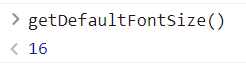
const result = Number(widthMatch[0]); return !isNaN(result) ? result : null;};Once invoked in the developer tools console on the empty browser tab, we get the expected value 🎉.
Case 2 - Relative font size on the root element
It's common to set the relative font-size on the html element mostly if you use relative units in CSS stylesheets. Consider the example below.
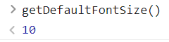
html { font-size: 62.5%;}It's the trick frequently used to have a good baseline when using rem unit in CSS. With solution from the "case 1" in place, if the browser font size equals 16px then the getDefaultFontSize returns 10. That's because 16px * 0.625 = 10px.
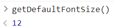
After changing the default browser font size to 20px the getDefaultFontSize returns 12.
What does it mean for us? The result still linearly depends on the user's settings. To "reproduce" the original browser font size, we need to divide the result by the factor that reduced it before, in this case, 0.625. The previous regex does not expect decimal values as 16px \* 0.625 = 10.625, so it needs to be fixed as well.
const getDefaultFontSize = () => { const element = document.createElement('div'); element.style.width = '1rem'; element.style.display = 'none'; document.body.append(element);
const widthMatch = window .getComputedStyle(element) .getPropertyValue('width') .match(/^(\d*\.?\d*)px$/);
element.remove();
if (!widthMatch || widthMatch.length < 1) { return null; }
const result = Number(widthMatch[1]); return !isNaN(result) ? result / 0.625 : null;};With this in place with 16px as a browser font size we get 16px from the getDefaultFontSize function ✌.
Numbers are a tricky topic in Javascript when it comes to multiplying and dividing.
This code works with font-size: 62.5%, but if you use a more exotic factor, Javascript numbers operations might return weird results. In this case, consider using the dedicated library for numbers like big.js.
Case 3 - Absolute font size (px) on the root element
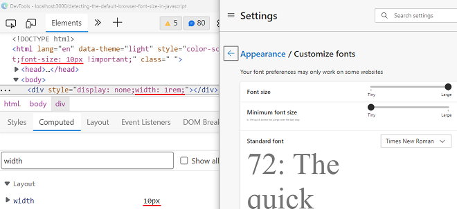
You won't be able to leverage the computed style on the dynamically created div elment if you've got the absolute font size set on the root. Consider the example below.
html { font-size: 10px;}The computed font-size property, in this case, is fixed, and the browser settings changes won't have any impact on this. If we set the width property of the div to 1rem it will always be 10px. With getDefaultFontSize function from the "case 1" it will return 10px independently from the browser settings 😕.
It would be possible to unset the font-size on the html element before getting the width of the dynamically created div element. We could set it to the initial value after that. I would highly recommend NOT going this way because it might cause layout shifts.
// THIS SOLUTION IS NOT SUGGESTEDconst getDefaultFontSize = () => { const html = document.querySelector('html');
const initialFontSize = window .getComputedStyle(html) .getPropertyValue('font-size');
html.style.fontSize = 'unset';
const element = document.createElement('div'); element.style.width = '1rem'; element.style.display = 'none'; document.body.append(element);
const widthMatch = window .getComputedStyle(element) .getPropertyValue('width') .match(/\d+/);
html.style.fontSize = initialFontSize; element.remove();
if (!widthMatch || widthMatch.length < 1) { return null; }
const result = Number(widthMatch[0]); return !isNaN(result) ? result : null;};Honestly, the better approach would be to not set the font-size on the root element at all 😅.
Conclusion
You can easily get the default browser font size from JavaScript. The presented solutions work fine with no font-size property set on the html or font-size with relative units. I would not recommend it if you overwrite the font-size property on the root element with absolute units.
Do users use different default font sizes? Yes, they do, rarely, but they do! It's worth respecting their settings. Questions or problems? Write the comment below!